
Red intake manifold pics

Thread Starter
I came, I saw, I boosted.
Joined: Apr 2001
Posts: 1,921
Likes: 0
From: Windsor, Ontario, Canada
Red intake manifold pics
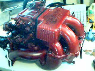
Hmmm....I went crazy with the Dupont Metalcast paint... it gives a finish that's like anodization. It's basically clear, high gloss, with a color tint.
I was going to polish the whole thing, but that's just sooooo much work. This took 10 minutes.
The pics don't really pick op the gloss and the transparent look though. Oh well. Looking forward to getting the damn engine back though!!!!
I was going to polish the whole thing, but that's just sooooo much work. This took 10 minutes.
The pics don't really pick op the gloss and the transparent look though. Oh well. Looking forward to getting the damn engine back though!!!!
Last edited by Bambam7; Apr 10, 2003 at 09:57 PM.


Banned. I got OWNED!!!
Joined: Jan 2002
Posts: 148
Likes: 0
From: east brunswick, NJ
personally, i think black lettering looks nice..
http://geocities.com/jcinarx7/page18.html?1049644906330
go down, thrid pic. ^
http://geocities.com/jcinarx7/page18.html?1049644906330
go down, thrid pic. ^
Thread Starter
I came, I saw, I boosted.
Joined: Apr 2001
Posts: 1,921
Likes: 0
From: Windsor, Ontario, Canada
I just ran a grinding stone across the top, and took the paint off the letters and ridges. It's a night and day difference!
I'll post some pics in a minute.
BTW, in the pics it makes the paint look really dark, and off color, not matter how I adjust it.
Thats a $20 webcam for ya.
I'll post some pics in a minute.
BTW, in the pics it makes the paint look really dark, and off color, not matter how I adjust it.
Thats a $20 webcam for ya.
Last edited by Bambam7; Apr 10, 2003 at 10:37 PM.
Trending Topics

Damn BamBam, why to go, really like the natural letters. To be honest I thought it looked like crap at first, but the natural letters pic changed my mind. Now you just need to put it on so we can see pics of that.
Thread Starter
I came, I saw, I boosted.
Joined: Apr 2001
Posts: 1,921
Likes: 0
From: Windsor, Ontario, Canada
Ya, I wasn't too impressed at first with the initial result, being all red- too monochromatic, but I was bored and just wanted to do something different. I'm really surprised at how the brushed letters really made a night and day difference! I'll consider that a success now!
Full Member
Joined: Oct 2002
Posts: 61
Likes: 0
From: Gilbert, Arizona
Damn You!!
Just when I thought that I was done working on the cars in my stable, you had to come along with this idea! The original picture didn't look too good, but now that you brushed the lettering and ribbing it looks too good to pass up. That's gonna look great on my wife's red 7. If my son sees it he's gonna want to start tearing down his '89 Supra Turbo to paint engine parts. His is red, too. Looks like a winner to me.

Thread
Thread Starter
Forum
Replies
Last Post